


All Hallow's Eve
Night Gallery's second drop, October 2020, was for the ghouls

I know I said I’d be writing about an old drop and the current drop but I’ve decided I lied to you about that. Chronological order feels better. I can look in the rearview with clarity rather than trying to justify what I have currently just done. It’s better for you this way too since you get a better, fuller story.
The Night Gallery October 2020 was our second drop. At this time, my old business partner and I had essentially threads of ideas about what should be designed and what our stuff should look like. Knowing we were not really sure of who or what the Night Gallery aesthetic was or even could be allowed us the space to design however we wanted. More than anything it allowed me to keep experimenting with design styles that played off of what inspired me; specifically Boot Boyz and Online Ceramics. Who couldn’t have been inspired by them? They were and are the cornerstones of modern merch design. I think I was really swinging for the fences when I’d open up Photoshop and be like, alright, I’m making something that looks like that.
It’s comical to me now because I can look at the process and say to myself, you should never open up Photoshop or Illustrator or whatever and be like, okay, time to make something exactly like someone else. I don’t think I’ve done that for years but it’s fun to look back and identify these moments of creative naiveté. It’s also a relief to know that’s much less of the headspace I’m in when I design now. But, like I will often hammer on, it’s better to just tell it like it was. It’s better to stay true.
Admittedly, I sort of fear moments like this where I call myself out or identify how my creative process was a bit indulgent on other peoples’ styles. Though I have to admit, these things being said publicly from my own mouth make me at least a little more secure than them coming from someone else’s. I do have a slight fear that it diminishes the work I do now but I also think it’s important to be transparent and honest when telling the Night Gallery story, whatever that is, so far. Though it probably is relatable. I hope.


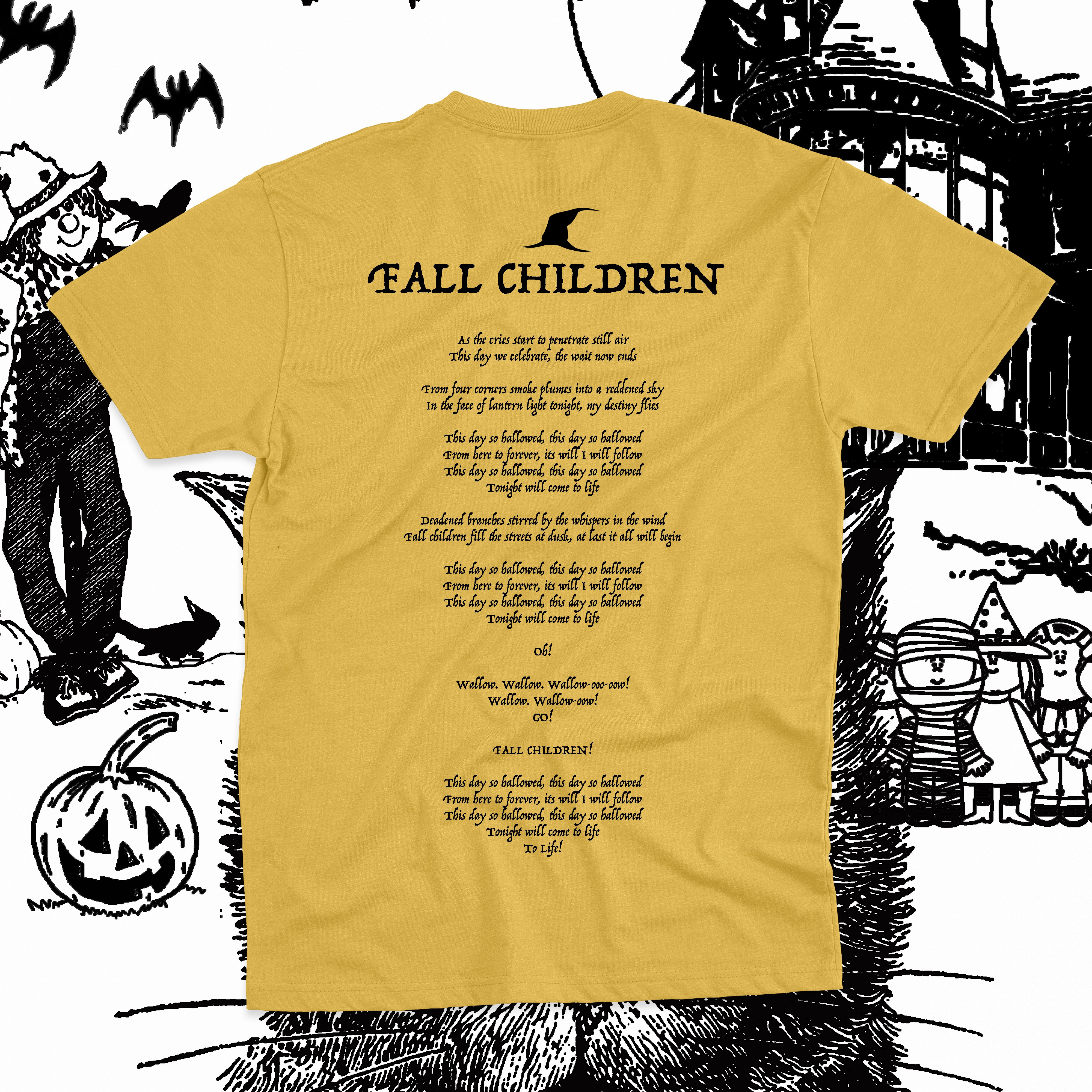
This AFI design was a pretty ambitious leap for me at the time. It was very much turning the knob up to ten with Online Ceramics in mind. Where the prior month’s designs were fairly simple, this one required me to compose more in terms of creating a scene and also pushed the visual storytelling a bit more. With the prior month’s Radiohead and Oasis shirts there wasn’t much of a story since the assets were an old ad and a logo and text. While I really have an appreciation for those moments and their simplicity I think I really needed to know that I could tell a story on a shirt. It needed to feel playful and fun. As much as we were fans I think we needed people to know that we had a sense of humor too. That we weren’t just like… stern designers. To be fair, we were also not considering ourselves designers. But you know what I mean.
I do think this is a really strong swing even looking at it five years later. I really like how it uses the more subtle assets from AFI’s Art of Drowning artwork across the front design — in the cat’s eyes with the demon, the bats, the pumpkin, the old logo. It has a charm to it that nods to a more crude, kind of early era Online Ceramics.
The back is not very complicated but is one of my favorite AFI songs. I think we just wanted to be straight ahead with the back and not overdo it. Simple witch hat, simple lyrics in Trattello font. I hate that font now. It’s like the go-to stock “spooky” font. If you ever see me use it, please do call me out and ask what happened to my brain. One thing I did really like about this shirt was this intensely dyed blank we found online. I can’t even remember the site we found it on but it really did look exactly like the mockup. I’ve only seen a few of these age over time and I’m not even sure I have one of these in my archive but the handful I know exist have aged in a really charming way. The fades are nice and the cracked ink is stellar. We did this same design on yellow in the same drop. I can’t remember how many of these exist in total… probably about thirty yellow and twenty-five dyed.

Again, not one to stay in any one place design-wise, we opted to do a Psychic TV design that was pretty referential and once again edging back toward the Boot Boyz style of composition and density.
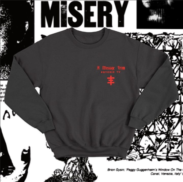
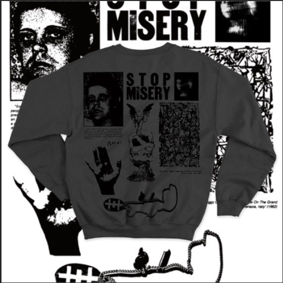
Again, looking back on this, I really do stand by it design-wise overall. It got pretty close to both the inspiration and with a few tweaks, is not something I would be afraid of putting out now. The back is a menagerie of things that existed in or around Genesis P-orridge’s world — Brion Gysin art, the temple pendant, Gen’s portrait and quote, and some visual pulls from old industrial zines. I might make that pendant go a bit wider now, from end to end of the bottom of the design then add a layer of color to brighten it up, but black on charcoal blanks looked really strong, and the front red (I think) was puff print.
I think here the storytelling aspect was definitely coming into play a bit as well — wanting to show Gen and h/er world and influences as the temple was coming into being. Have to say though that there is so much going on in that scene at that time, it’s almost impossible to fully tell that story on a garment, this captures maybe three or four years of it. Maybe.
This design does start to bring a key component of Night Gallery together — the need to do a lot of research on a subject and to not impose a visual world on it that does not feel authentic or true. I chock this habit up to a few influences but primarily my experience working at a Chicago ad agency where my boss would often decide or kill creative campaigns based on how truly authentic and real they were. As an employee it was both amazing and painful to watch as it often caused our small team long nights and laborious strategy sessions, but the results were almost always truly authentic. Anyone who is familiar with agency work big or small can relate, I’m sure. His intuition and desire to be true and tell a real story was something I did and still do admire. It became a cornerstone of my design process. I am incredibly grateful I decided to build this habit early on because I do think it’s a big part of why some of you are here and reading this.

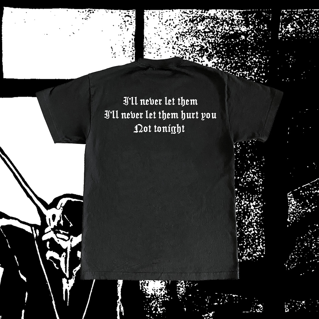
The third design in October 2020 was my favorite. It’s a My Chemical Romance design that is built on the artwork of this really bizarre Batman Elseworlds comic that I bought on tour somewhere in Michigan when I was 17. Batman was a sort of Nosferatu-style vampire and The Joker was a strange marionette and it drawn in this amazing German Expressionist style that felt really cool. When I decided to make a MCR design I actually had no idea how I’d want to visually represent them but I did know that my favorite album of theirs is the first, that I did and do love vampires and Batman, and that Gerard had a similar affinity for comics. Those three things being the connective tissue of the design felt like enough to start.
It’s not a super complicated design honestly. I think I just tweaked a panel with the threshold tool (classic design move) and overlaid it to white. The front has The Joker, Barbara Gordon crying, and Batman in this pre-duel face-off and the back is slapped with classic lyrics from Vampires Will Never Hurt You that narrate the scene on the of the front of the tee.
This shirt really reminds me of a shirt you’d find at a merch table from a local band who didn’t really give a shit about over or under designing anything. Just some guy in the band hanging out in his room with the rest being like, “hey look at this cool thing in this book I’m reading” and then slapping it on a shirt. It’s vaguely, more gothically reminiscent of those Earth Crisis comic book shirts with Wolverine on them. I thought a lot about Gerard’s early looks when designing this shirt and how it was sort of Ink and Dagger adjacent and imagined the shirt aging in this sort of cracked, busted, nasty way with holes in it and was like… yeah, if that can be this design’s destiny… that would be cool. This is a local dank wet basement show kid shirt. This is one you beat into the ground until the ink is chipped off.
Can’t remember how many of these exist but I’ve seen them on a few My Chemical Romance Instagram fan pages. Have to guesstimate that there are maybe fifty of them.
October was a fun time for us. It really set off and cemented a few things; storytelling becoming heavily integrated into the design process, pushing ourselves to get better quickly, making sure each design felt real and true to the subject, and not being afraid to go simple. We still had no idea who we were or if we should call ourselves designers. We had maybe 700 followers. We were both a spark of something and nothing at all. It felt so exciting to see people reacting to these designs and wanting to wear them. I think there was and is a real charm knowing that someone three states over or overseas wants to wear something you designed (especially when you design it out of love).
In 2025, all of these habits remain present. I feel so grateful.